Wi-Fi Performance Reporting App
...A mobile application for students, faculty, and staff to report satisfaction (or more likely, lack thereof) of Wi-Fi service across the CU Boulder campus.
Tools:
Figma
Adobe XD
Adobe Illustrator
Jira
My Role:
Project Manager
UX Design
UX Test Manager
Scrum Leader
Marketing Lead
Skills:
Prototyping
User Testing
App Administration (Android/Apple)
Marketing Strategy
Data Analysis


CONCEPT
Our intention was to create a means to crowdsource user opinion data (also known as Quality of Experience) and couple it with technical details of the Wi-Fi network connection without placing a heavy burden on the user or our service teams.
This pilot achieved the goal by making it easy for the user to submit a report through the app, which unobtrusively submitted technical details for wireless access point (WAP) identification by our networking team.
Below you will find abbreviated elements of the design and plan, including persona development, requirements, prototypes, marketing, and data visualization of results.
Undergraduate Student

PERSONA #1
Donna is in her first year of college at CU Boulder. She is 18 years old, calls southern California home, and this is her first time away from home other than summer camp. She has not declared a major yet, but is considering psychology as her field of study.
Faculty Member

PERSONA #2
Frederique came to CU from France four years ago to teach French and International Business. He continues his involvement in both departments, although his involvement in the business school no longer includes teaching since becoming Chair in the French department.
Visiting Presenter
PERSONA #3

Nora is visiting CU to present a proposed nuclear weapon policy for the Conference on World Affairs. Her presentation includes a slide deck stored in the cloud, which she has to amend at the last minute.
1. User will be able to open the app and submit a rating of Wi-Fi experience at that moment.
-
Regardless of the strength or weakness of the Wi-Fi signal, the data will still be collected.
-
In instances lacking Wi-Fi connection, the collected data will be sent as soon as the connection resumes.
REQUIREMENTS
2. Engineering team will receive anonymized data points sufficient to determine:
-
the location of the user,
-
the connected access point, and
-
the user's opinion.
3. Must be simple for the user to understand (no thinking required!) and lightweight for the device.
User Test Summaries:
PROTO "A"


Users reported this prototype to be simple, but too bland. One user felt the binary option was too constrained - he wanted more than two options. Other feedback included the user being unsure what to do following the results screen, and desired the app to transition or close.

PROTO "B"
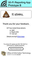
Users noted this design had a fun flair. The poop emoji definitely got the testers’ attention – many laughed. Some loved the emojis due to the element of fun, others poo-poo'd it and found it to be unprofessional.

PROTO "C"

Strong positive feedback was received in that the interface was clear and recognizable based on other popular applications, yet others reported the interface to be too sterile and industrial. Since the location details were listed before the user offered a rating, it was noted that it felt “creepy,” in that the tester didn’t feel like he had given the app permission to know his location.

FINAL DESIGN
The final design was simple and elegant, composed of two main screens.
1. Pick a face
2. Complete!

3. Wi-Fi details sent to the cloud

MARKETING
Once the app was created and tested, we faced the challenge of awareness and adoption. How would we encourage our target audience to use the app? Our core team, along with the departmental communications team, came up with a strategic marketing plan:
-
Postcards at Student Involvement Fair
-
Pizza giveaway for students with the app
-
CU's online newsletter
-
Digital signs around campus

Postcard
Digital Sign


What better way to understand the data than to "see" it? We took the GPS coordinates of the individual reports, along with the 3-point rating scale (red='bad', yellow='ok', green='good') and plotted the points on a map. This allowed our engineers to see the concentration of reports so they could focus improvement efforts in the most needed areas.
DATA VISUALIZATION
CONCLUSION
The result was a successful mobile application in production and available to campus users on the Apple and GooglePlay stores.
Just as the user base was beginning to grow, Covid forced campus operations to become fully remote in March of 2020. The future of the app is unknown, although campus is continuing to strengthen its Wi-Fi infrastructure.